Many Veo One users are large users who process thousands of alerts per day. Our current alert working system is not large user friendly.

< Legacy Alerts in Activities page >
There are three different way to let user check alert. Alert large view, alert small view and alert quick view.
There are three different way to let user check alert. Alert large view, alert small view and alert quick view.

< Alert large view >
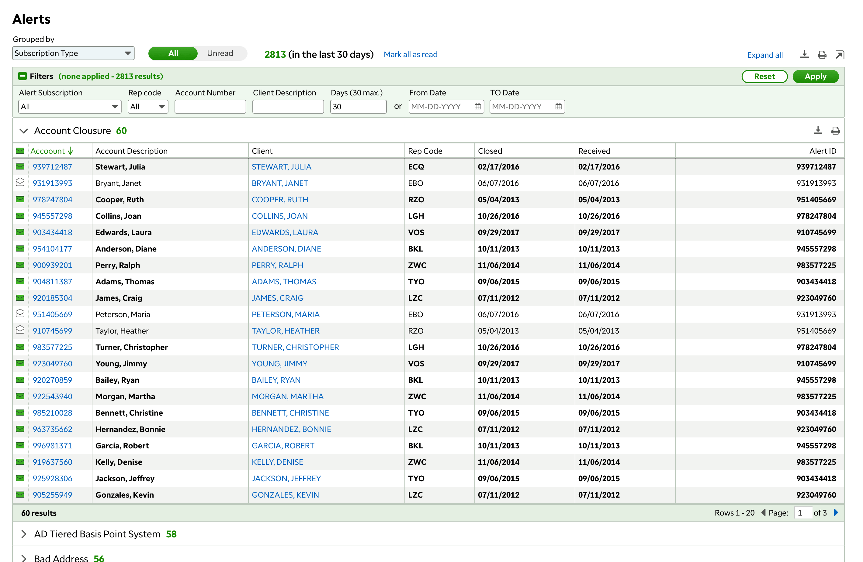
Alert large view is available in Activities page. Alert large view keeps last 30 days alert records. User can filter by alert type; alert subscription; rep code and date range. There are two different way to group alert in large view, "view by Alert subscription type" and "view by Most recent". When user select "view 'Alert subscription type'", all alerts are grouped under different subscription, alert details are displayed by different data columns.
According to the user research, I found out that most of large users prefer to checking alerts in alert large view. However, many of them don't know how to find alert large view.

< Alert small view >
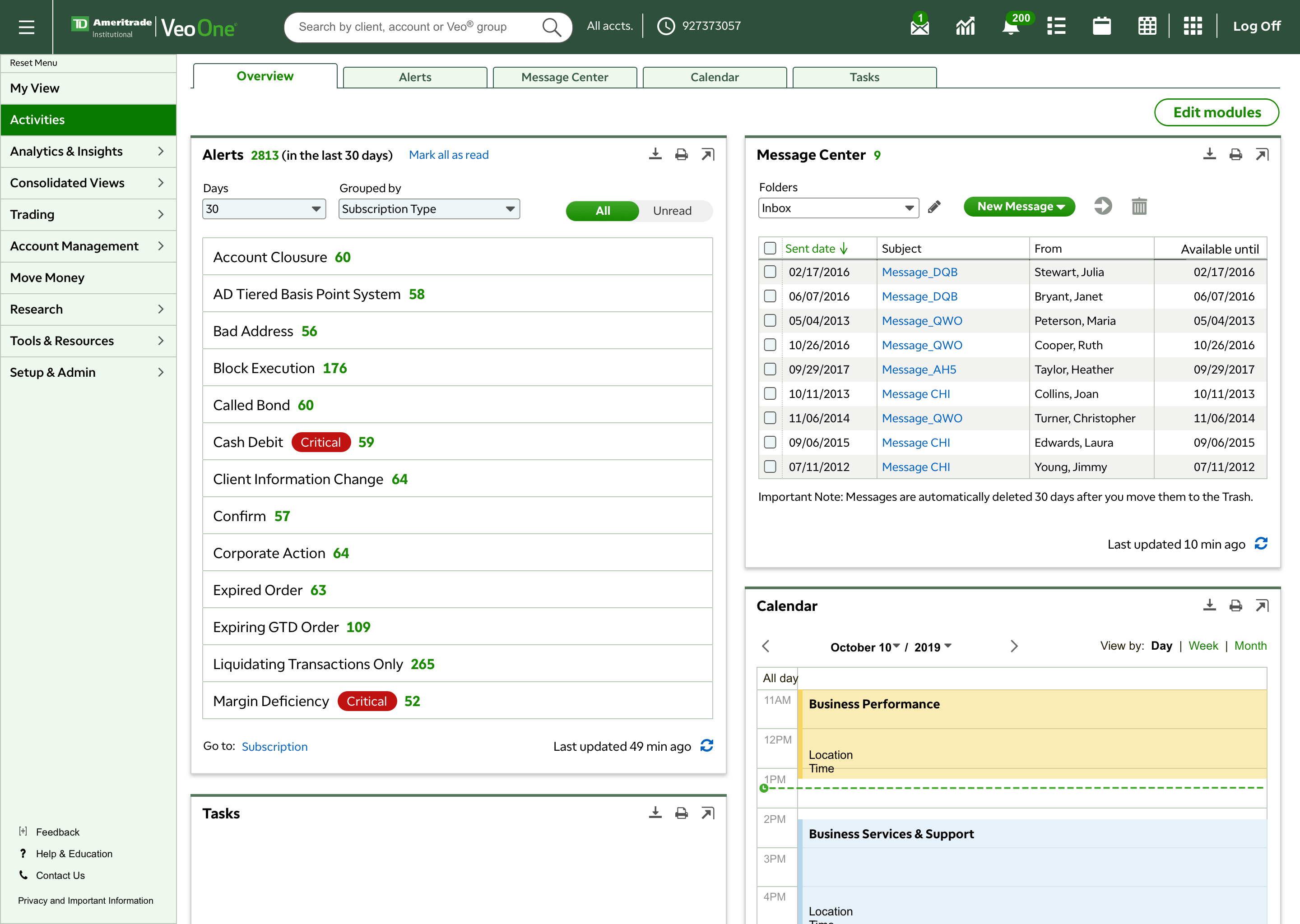
Alert small view is available in My View page (landing page), Activities page, client portfolio page and account portfolio page. In small view, user can only read alerts through "view by 'Most recent'". Showing last 7 days unread alerts is default. Alert small view includes Alert Subscription, Alert ID and Advisor (rep code). User can read alert details by clicking the ellipsis icon on the left side.
Alert quick view is available in any page in Veo One. By clicking the bell icon on Veo One header, alert quick view will launch as a pop over. Alert quick view is similar as alert small view which is "view by 'Most recent'" only. Alert includes basic information such as Alert Subscription, Alert ID and Account number. Alert detail is not available in quick view.
< Alert quick view >


1.
2.
3.
4.
5.
6.
Mark as read - In legacy alert, when user click the green icon to mark this alert as read, that alert will immediately disappear without any animation. Sometimes users won't realize that they have marked this alert as read. Many users complains that after they mark the alert as read, they cannot find that alert.
Horizontal scroll bar - Some alert subscriptions have many columns which involves horizontal scroll bar. According to the user research, I realized that many users couldn't notice that there are extra columns.
Unread alert total counter doesn't reflect filter results.
During user interview, most of the users couldn't find the "unread/all" toggle button. It is hard for user to realize that current page is "unread alerts" only.
During user interview, all the users couldn't find the info which explains that Alerts are available for 30 days.
Most of our users don't know by clicking the arrow icon, user can switch small module to large module (working space).

1.
2.
3.
4.
During user interview, most of users don't recognize this ellipsis icon and be afraid to click it. Plus, this pop over is hard to read.
Most of users don't know that by clicking this arrow icon, alert small view will switch to working space as alert large view.
Most of users don't know by clicking the header name "Alerts" can go to alert large view.
Unread alert counter doesn't reflect default filter in small view (last 7 days).
John Smith works at a large finance firm as an admin person. Every day John starts his work from checking Veo One alerts. He would like to see is there any NIGO, checking for New Account open status, Account Closure and Client Information Change. Sometimes he also checks Money In and Money Out. John needs to export or print some alerts to report to his team.
Calvin works at a large finance firm as a trader. His daily working process starts with checking alerts and ends with checking alerts again. Calvin could receive thousands of alerts per day. Although Calvin is more focus on trading alerts, he also expects Money In. Sometimes he goes to certain account portfolio page to check the whether certain money arrived, then he will start to submit the trade ticket. Block Execution, Order Filled, Unallocated Trade and Confirm is also important for him.
Jan works at a small firm. She does everything.
In legacy Alerts, there are 3 alert types, Accounts, Cash Management and Trading.
Under these 3 alert types, there are 34 alert subscriptions. In my early design concept, alert can grouped by alert type, alert subscription and received date. However, after user testing, I found out that most of the user focus on alert subscriptions more than alert type. For example, a trader not only check alerts relate to Trading type, he/she also check money in which belong to Cash Management type. Based on that, I decided to only group by alert subscription and received date.
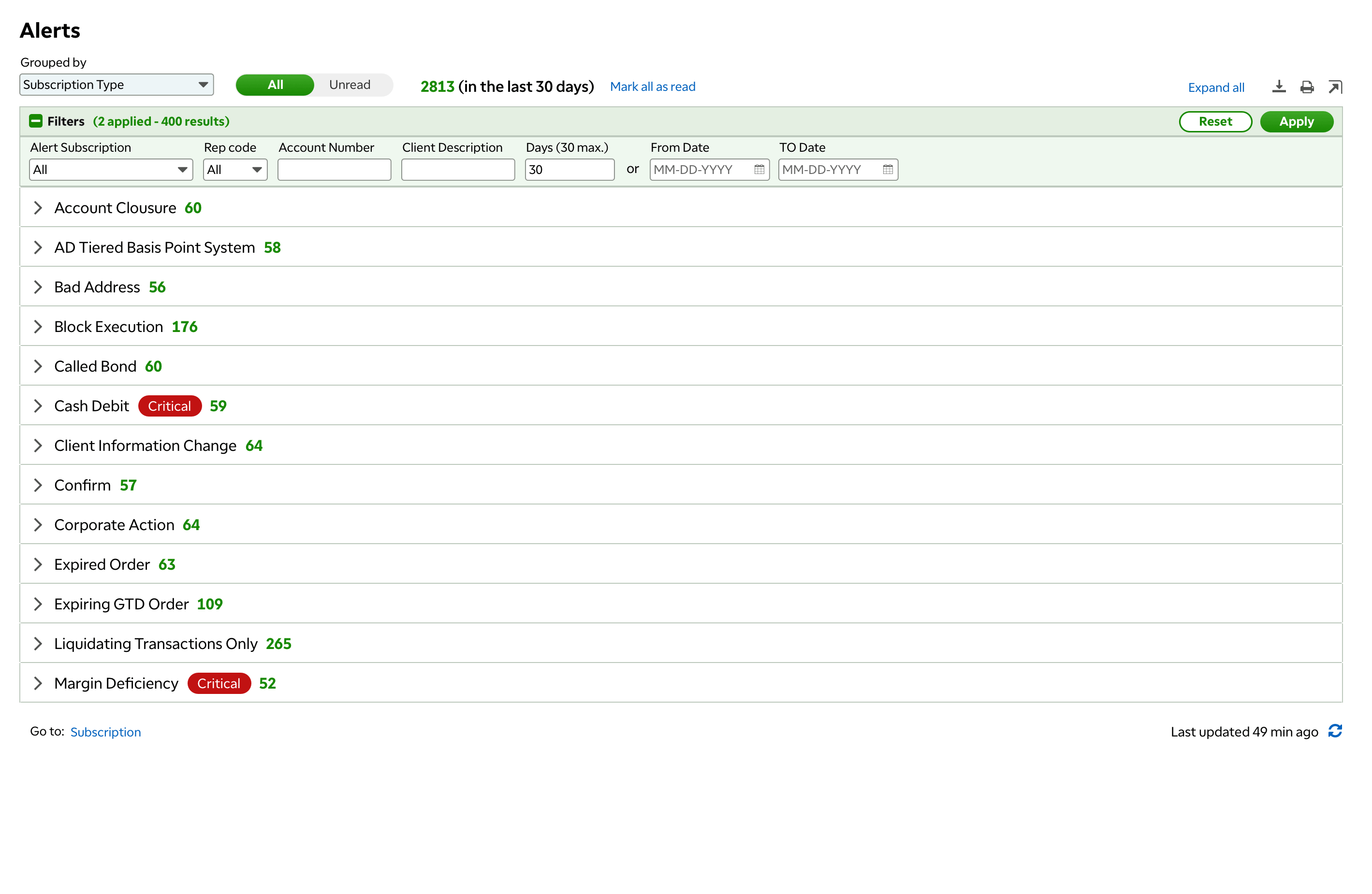
Grouped by "Subscription Type" helps large user to process their alerts. When user lands to this page, instead of seeing all alerts details, they see a summary page. User can just expands certain alert subscription to check. Each subscription type can be marked all as read, print and export.
Grouped by "Date" helps users who don't have large amount of alerts or the one who doesn't need to focus on processing alerts. For example, our persona Jan Brady, who works in a small firm, Jan has to work on everything she needs, "Date" view can directly give her all alerts details.
Like I mentioned above, "mark as read" feature in legacy Alerts has no animation. When user mark the alert as read, that alert immediately disappears. In the new design, my first concept was adding some animation to help user notice that the alert got marked has gone. However, after discussed with dev team, the animation will cost extra calls.
Without animation, how can I solve the problem? Let's keep it simple and stupid. I re-design the icon to an envelope shape. Unread alerts is a green closed envelop, read alerts is a grey open envelop. The icon has tool tip to avoid confusion. In addition, instead of show "unread only" as default, I changed to show "all" alerts as default. When user mark alerts as read, the alert won't immediately disappear.
User can also mark all this subscription alerts as read, mark all alerts as read. When user mark all as read, a confirmation message shows as a pop over.

Legacy Alerts' total unread alerts counter doesn't reflect the filter. In legacy alerts, we show last 7 days unread alerts as default, there is a light grey filter pill shows "last 7 days" applied. However, most of our users don't notice that and it get confusion. Many user misses alerts since they only see 7 days alerts as well.
In the new design, I work with our UX copy writer to have a clear copy to help user understand that there is # unread alerts in the last 30 days. Also, I changed the default filter in alert large view from 7 days to 30 days.
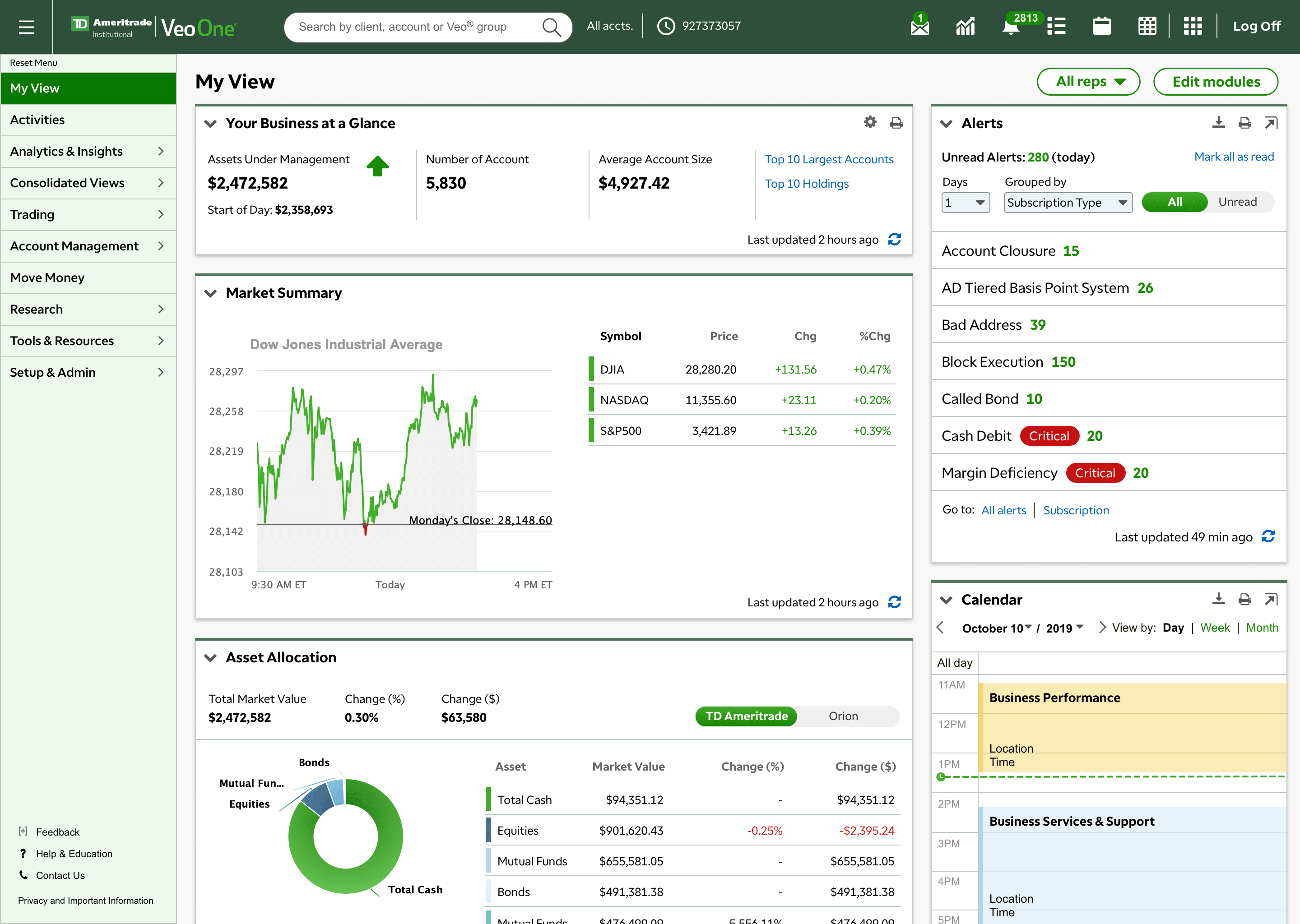
In Alerts small view and quick view, instead of clicking module header to go to Alert large view, I just add two hyper links in the module footer - Go to Subscription | All Alerts. In the user testing, all the users joined the testing realized the two hyper links and understand the function.
When user click hyper link "All Alerts", page will refresh to "Activities" page with Alerts module in large view (auto switch to working space). All alerts will show last 30 days alerts (max days), if there is any previous filter applied, the filter will get removed.
Because we have limited width, for some alert subscriptions have many data columns, there is a horizontal scroll. For reducing unnecessary scroll, I worked with Product Manager to re order all the columns. We listed all 34 different alert subscriptions, for each of them, we move the most useful data to the left side. For example, "mark as read" icon are moved from the right side to the left, user can mark alert as read without any horizontal scroll. Alert ID column are moved to the far right side which barely been used according to our research.
When I was working on Alerts, Veo One got the new visual design system updated. We update the font from Ariel to TDA font, also font size updated from 12px to 13px which is easier to read. I use new filter style which saves a lot of vertical space. I was one of the main designer responsible for new Veo One visual design library. For details, please see New VD system (coming soon).
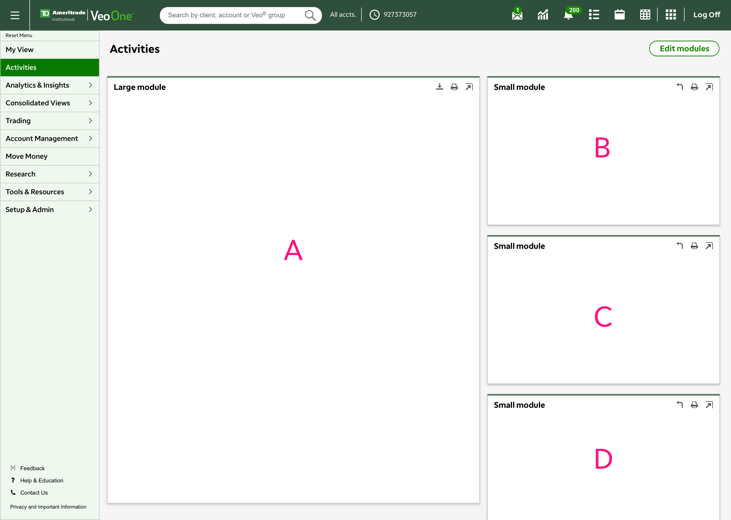
Current Activities page frame has one large module and multiple small module. When user clicks the arrow icon, small module will switch to left side as large module. However, this page frame has some problems. First, many users don't understand this arrow icon. In addition, the large module still has very limit space for user to work. In user interview, all the users attended the testing would love to have a whole page to work on alerts, messages and even tasks.
In future design, we are going to add different pages in Activities. Overview page will have multiple same size small modules. User can open each small module in a full page to see all the details.