
Option Chains redesign is one of my favorite project. I started this project from knowing nothing about option trade. One day, my manager suddenly told me that I need to work on this project. The team I work with was a new team, all developers are from a third party company, and the PO who was responsible for option trade has left. At that moment, we didn't know who would be the new product manager, and nobody in my team really knew Option Chains very well.
I did some basic check for the page with my manager together. It was a framed old page from legacy Veo. You can see the page width is narrow, and the visual style is out of stage. To be safe, my manager recommended me that I should only do some visual updates, using the new Veo One style to replace everything.
"That sounds good" I told myself that it was great, this project will be easy. However, when I started to draw the page, I realized that I still need some basic understanding about each feature. What is Chain type? What is Strike price?

Section 1
Section 2
Section 3
<legacy option chains>
Section 1 includes Symbol search, Chain type, Option range, Expiration, Strike and Index List.
Chain Type has: Calls and Puts, Calls, Puts, Analytical, Vertical Call Spreads, Vertical Put Spreads, Calendar Call Spreads, Calendar Put Spreads, Straddles, Strangles and Buy/Write.
Options range includes: Near The Money, In The Money, Out of The Money and All.
Strike is for filtering strike price. Click the green button "View Chain" will refresh the page to show searching results. In the very right side, there is the hyper link "Index List" which can launch Index list window.


Section 2 is for underlying price. In the left side, the symbol is a hyper link. Click the symbol will refresh current page to Research page. Also there is an action icon, by clicking this icon, user can trade, check Research, check quote details, see chart and see option chain.

Section 3 is about the Option Chains. Amount of chains shows is depending on what "Expiration" user selected.
While I was working for Option Chains, there were many other framed old page need to re-build. Option Chains was the last one, so it gave me enough time to do research before I start design. I reached out to one TOS designer who knows trading best among our design department. We set up an hour meeting, he quickly introduced some basic norms to me and shared some very helpful online course links.
There are so many different course and shows talking about option trade. One thing I found very interesting was that when people try to explain different option trade strategies, some people talks for hours and I am still confused. But some people only talk few minutes can give me very clear structure. Isn't that similar with product design? Sometimes designers are too smart and they create complexity which only smart user knows how to use.
In my study, I found that option trade is more like doing a piece of art. There is no certain way to achieve, different traders have different method or preference to trade. Some traders like using Delta to measure, some traders see volatility is the most important thing, and some traders like trade puts much more than trade calls. If users have such big different preference, will customization be a good choice for them? Shall we provide user multiple pre-defined feature?
I am proud of myself about how many problems I found. When I brought those problems to my product manager, he was such surprised, there were some bugs he even didn't realize.
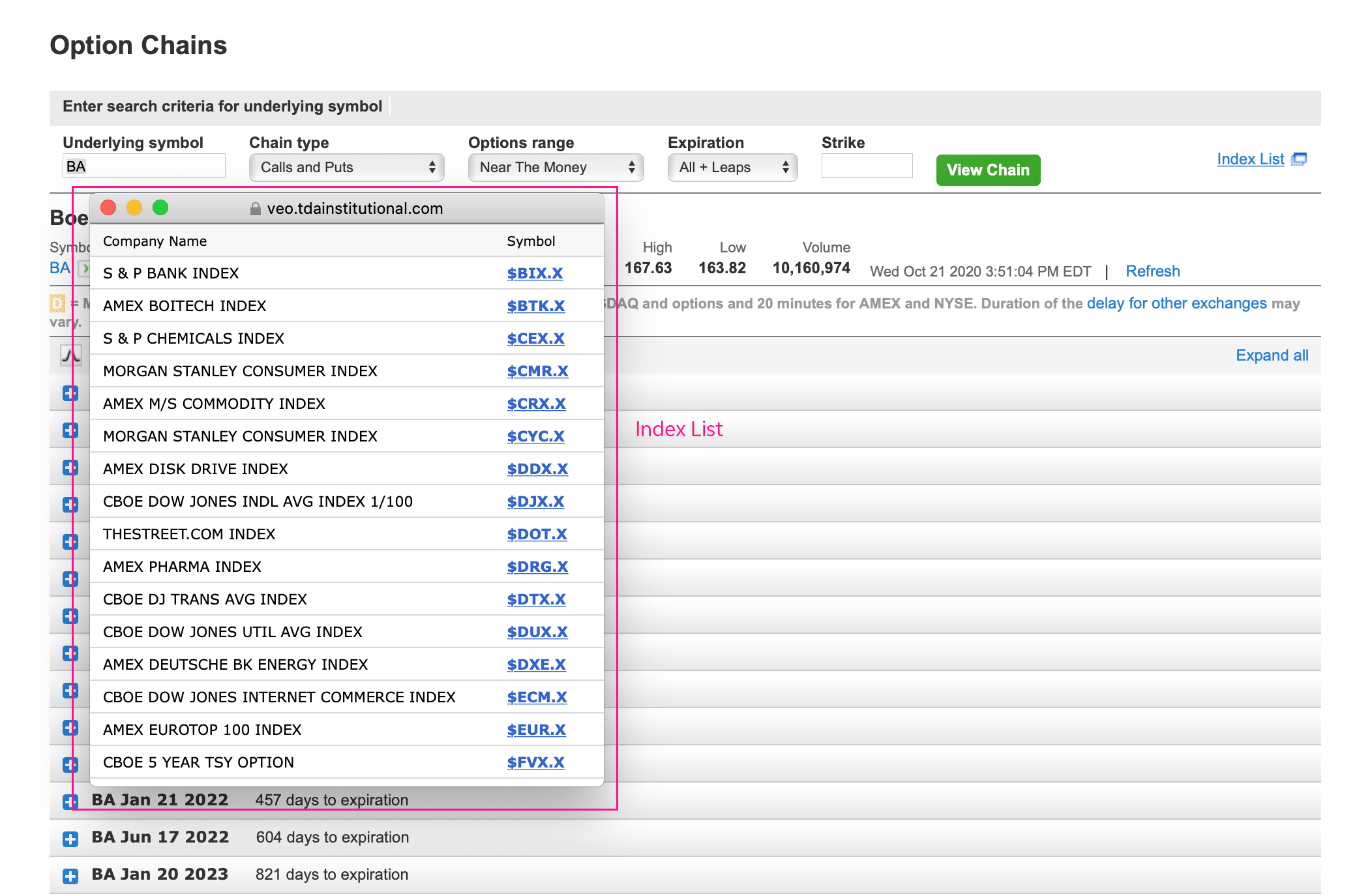
Like the image shows above, most of the index symbol doesn't show any option chain information. If most of them don't work, why do we show here?
2. Not using universal language
Most of our trading platform, we call "Strategies " instead of "Chain Type". When I brought this problem to my product manager, the answer was "yes, it was not very common for using 'Chain type', maybe because this page was very old, some of the name people are no longer using them."
If "Chain type" is not a common name, shall we use a common name to help users easily understand?
3. Chain type structure is confused
Under "Chain type" menu, I found the structure was confused. It includes some column views and some strategies. For example, Calls and Puts, Calls, Puts are just different layout display which is not chain type. Analytical is a separate page to show all the greek data, which helps users make trading decision.
In addition, this menu is long, including many repeat words which could create some visual noise. For example, visually "Vertical Call Spreads" and "Vertical Put Spreads" looks very similar, user might select wrong chain type. If we just have "Vertical Spreads" and let user select "Call" or "Put" in the second step, it will reduce more mistakes. Same as Calendar spreads.

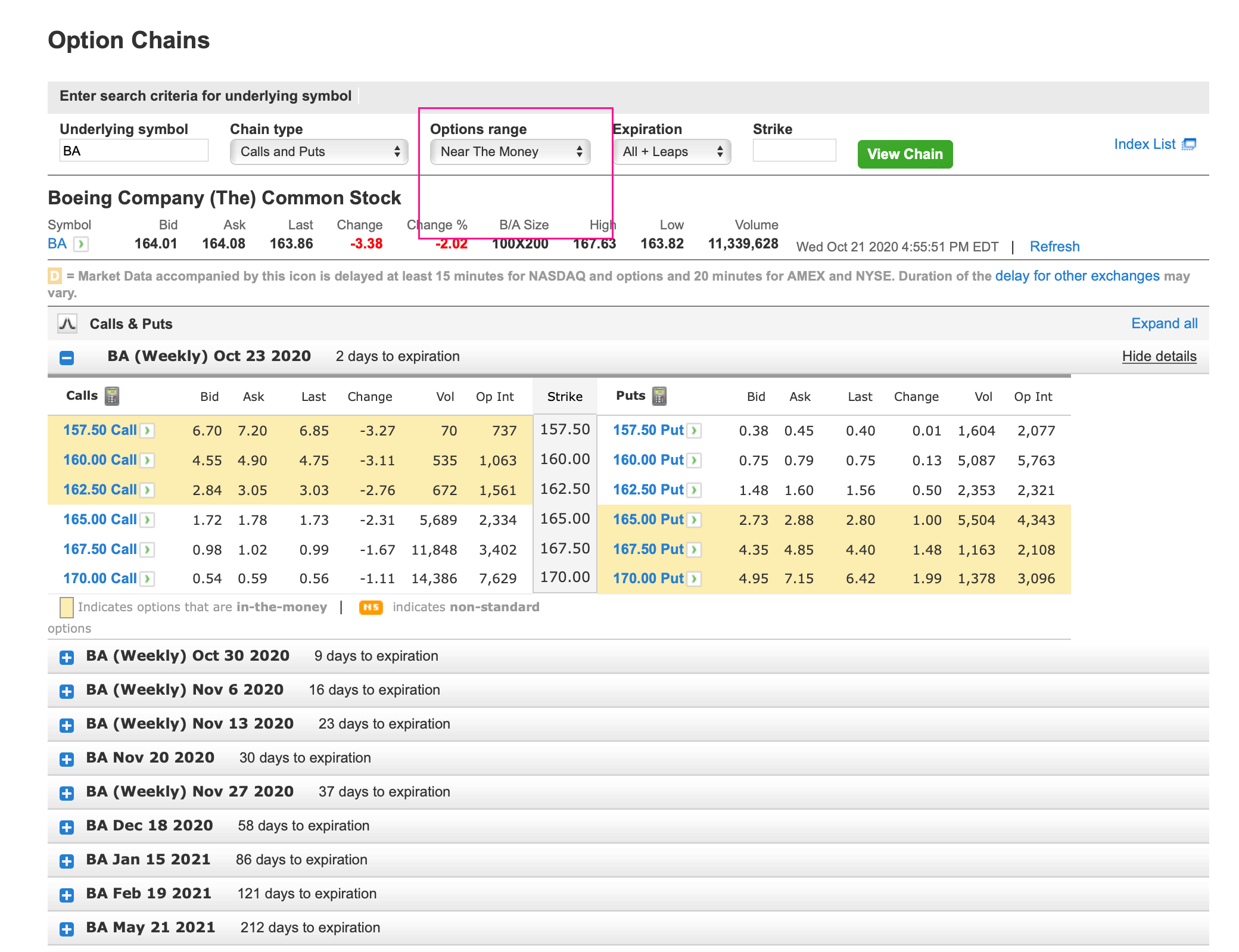
The image above demoed how did "Options range" work. In my understanding, it is a filter to let user select different strike price range. However, if we call "Option range", many users don't know what exactly mean. In the money, out of the money is not exactly option range.
Another problem for this filter was that when user switch "Near The Money" (default selection) to "In/Out of The Money", it shows all strike prices available. That will make the grid very tall with many useless information. This kind of view, user either gets very limited strike price if they select default view - "Near The Money", or they will get too many strike price. In my opinion, instead of giving users ability to choose the "Option range", selecting how many strike price to show would be more helpful.
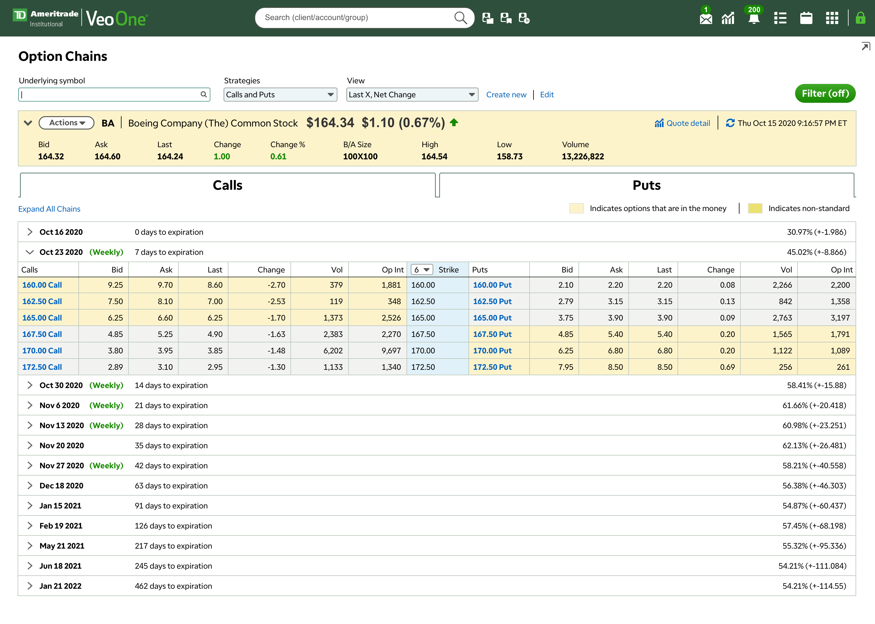
When you see the mock up above, you probably noticed that there are many unnecessary extra clicks. For example, every time when user change the top panel such as "Chain type", "Symbol", the grid below doesn't auto refresh. User has to click the "View chain" button.
Further more, all the chains are collapsed as default, every time when the grid get updated, all the chains go back to default which is collapsed. If user was looking at some chain in the middle, after he/she refresh the grid, the chain can get lost.
Last, there is no way to "expand or collapse all" the chains.

The legacy option chain table has very limited data columns. However, when I was working on Positions Management, I found that in Veo One, we have many data available. User can select more than 70 kind of data to show on their position table or watch list, many of these data are related to option trade. I believe that user would love to have ability to choose what they want to see. Actually later my thoughts got proved by doing user interview.

Action menu is a very powerful tool in Veo One. Every symbol has an action menu, in this menu user can trade, search this symbol in "Research", see quote details including charts and check option chain. This is one of my favorite feature in Veo One.
However, powerful tool doesn't mean it will be always helpful. In option chains page, if user click "Trade" link, user will navigate to trading page with automatically filled with this option symbol. But the problem is that when users do spreads, this way will only has one option symbol filled in the trading ticket. User has to save this ticket first, and go back to option chain page, find the other leg and copy the symbol.
Link "Research" is for stock/ETF and mutual fund symbol, it doesn't directly relate to option symbol. Detail quote is also available in Veo One header without refresh the current page.
In the end, I don't think user will click "Option Chain" in Option Chain page.
As a finance product designer, a comfortable visual design is important. Yes, I use the word "comfortable", not fancy, not trendy and not pretty. A bad UI style is more like visual abuse which causes terrible user experience.
I remember that when I work on Option Chains, we hadn't started to use data measurement. The only resource we can gain user feedback is from Veo One Client Opinion Lab. Many users leave their comments through Opinion Lab, and every week, we spend a hour to go over all the comments.
I asked my product manager that were there any user comments related to Option Chain? The answer was no, we got zero compliance about option chain. I couldn't believe that. If you see how many comments we get every week, how can Option Chain page has no review? But later I understood, it's not nobody complained this page, it's because the page was too bad and no users using that.
"We need to do some user research " I told my manager and the product manager. They were on the same page and gave me strong help. However, it was very hard to find someone who is professional option trader and would like to spend 30 minutes for the interview. Finally, instead of find some users to join the interview, we invited some internal traders for help.
This user interview is very different. I set three interviews, each one invited 3-4 people to attend, all of them are heavy traders. The first two interviews are before I started design, the third one we did was after most of the design done.
iRebal group includes three product managers, one is directly manages "rebalance portfolio" include option trade. There other two's work also relates to some option trading. All of them are not familiar with Veo One option chains, but they have a lot of valuable feedback and data from iRebal users to share with me.
I did some research about what is probability ITM. I didn't see too many information about probability ITM, but there are many videos and articles talking about probability OTM. Many traders use probability OTM as an important refer.
Why do iRebal users requested Probability ITM not OTM? ITM is more used for Calls, and iRebal now only has covered calls. But in Veo One, we do both calls and puts, so probability ITM and OTM should be both available.
Another valuable data iRebal users requested is the expiration days range. In iRebal, user can quickly select the expiration days from 0 - 365 days.
The new filter design in iRebal got a lot of good feedback. It is the same concept from Trade Architect - another trading platform from TDA.
The second interview includes three traders from Thinkpipes option trade strategy support team. All of them are heavy trader and have strong knowledge about option trading.
During the interview, I showed them the current Veo One option chains page and shared some feedback I got from iRebal team. They agreed on most of my opinion and also shared many thoughts with me.
All of them noticed that the trading logic and layout looks different from iRebal and Thinkpipes. This cause users to spend more time to get used to the new experience and many difference doesn't make any sense in their point of view.
I showed them some design concept, they don't have strong opinion, instead, all of them pointed out we need to show more data.
c. Most important data for different strategies
I couldn't believe that after the interview, they send me an email listed all the important data based on different strategies. It was such helpful, especially for filter design.

People hates too many unnecessary clicks and scroll, especially for traders. My first goal of this design is try my best to reduce extra clicks.
In legacy option chains, every time when user changes the top section (symbol, strategies or some other place), they have to click "View chain" button to refresh the grid. In the new design, since we are updated to new grid system, we don't need the "View chain" button. Instead, grid will be refreshed automatically.
When user first come to this page, "underlying symbol" searching field will be automatically on focus, so user doesn't need to give it a click, instead, they can directly typing symbol. After type symbol, hit keyboard "return/enter", grid will be refreshed.
Same way as strategies and view, when user switch strategy or view, grid will refresh.


Like I mentioned on the top, the legacy "Chain types" menu is too long and having many similar strategies, such as "vertical calls" and "Vertical puts". It is very easy for user mis-click. Also, It is hard to user to switch different strategy from a long drop down menu.
In the new design, I combined some strategy, "calls" and "puts" are both belong to "single", "vertical spreads" includes "vertical call" and "vertical put", "calendar spreads" includes "calendar call" and "calendar put".
Under different strategy, there are two wide tabs "Calls" and "Puts". If the strategy combines both calls and puts in one trade, grid will display both of them and the tab is not clickable. If strategy includes either call or puts, the tabs will be clickable. User can easily switch from calls to puts. The selected tab will have sticky state.
Sticky state is important for heavy users. The image below mocks up how sticky state works for option chain. When user expands different expired dates on the table, after the user switches different strategy, the expiration date will be remains to expanded. This solved one big problem in legacy page - every time when user refresh the grid or page, everything goes back to default.
Strategies and filter will also has sticky state. When user change to another symbol, the strategy user selected will remain.
Filter visual design was borrowed from iRebal. One of the reason was I want to keep TDAI products have the consistency and avoid creating unfamiliar environment. Another reason was that filter in iRebal had already got many good feedback.

<filter in iRebal>
Since iRebal only has covered calls, we have much more strategies available, the filter cannot be exactly the same. Probability data in my new design is a drop down, user can select ITM or OTM. I also add strike price width and strike price range as well, which is important for users.
Like I mentioned, doing option trading is more like doing artwork, there is no certain rule to follow to achieve. There is a big range of difference about users' preference. How can I satisfy most of the user's needs?
a. Customized column views
Customization is the most common way we chose for solving big range of differences. From the feedback I collected from the interviews, many users prefer to customize their option chain table. In that way, they can select their favorite data to show. In legacy Veo One, we only show very limited data, however, there are 72 kinds of data available related to trading. The reason we didn't provide them was that too many data column would impact performance. But now our grid has been updated. After confirmed with both business side and dev side, we are able to provide all the data available.

The image above shows the screenshot about customized/edit view. Data table customization is another big project I have done. I will spend another time to share it.
In Veo One, there are existing customized view for option positions. When we build this one, we make sure those views will automatically be shared for option chain.
In my opinion, a good pre-defined column views solves more problems than customized column. Many users hate too much customization. This was no pre-defined column views in Veo One for option chain. However, there are some available in positions - options and also in thinkpipes which we can leverage.
c. Bigger horizontal and vertical space
Legacy option chains page was a framed in page, even the Veo One page frame is wider (1440px), there still is a big empty space. In the new design, Veo One page is fully responsive, so I can give users bigger horizontal space to display the column.
All the column width are adjustable, user can drag them to re-adjust the width to their comfortable level.
Also, the new design saved big vertical space for reducing vertical scroll. For example, user can hide "underlying details" to get 2 extra data rows.


There were only 3 ways to select how many strike prices user would like to display. "Near the money" shows 3 rows of in the money strike prices and 3 rows of out of the money strike prices. If user selects "In/Out of the money", it will list all strike prices available in this date. That really didn't give users any good options.
In the new design, user can either type or select the amount of how many strike prices they would like to show.


On Veo One header, there is "Quote lookup" icon. User can quickly check the quote details and chart. Here we decided to have this ability for option chains. There is a hyper link "quote detail" on the underlying bar. By clicking this link user can quickly check the chart in a pop over layer. This is an exciting function for leveraging.
For future step, some users have permission about Y Chart, I hope we can give them the ability to toggle between Chart and Veo One chart.
Expand/collapse all is a very common feature, I was surprised that we didn't have it. In the new design, user can expand or collapse all the expiration dates.
Based on our research, many Veo One users are using multiple monitors. A child-parent window feature is very helpful. User can open a module or a page as a child window. By clicking child page, the parent page will get refreshed. The best example is "all accounts" window. User can launch all accounts list as a child window and switch different account number, the parent window will be refreshed to different account portfolio page.
In option chains, I selected the same idea. User can launch option chain page as a child window. Clicking different prices /symbol, the parent window will be refreshed to trading ticket page with pre filled symbol and price.
Final Design
Every time when I share this project to the other designers, they always ask that "Wow you did a lot, did your team take all the UX recommences and build that?" The answer is "Of course, no!"
After all these work I did with my team, we had a higher level meeting. Instead of adding all the enhancements, we have to cut more features. I agree with the decision because we don't have too many users using Veo One for option trade. Most of our users use think pipes for option trade which is much powerful than our option trading platform.
Below are the feature we are going to have:
-
New visual look (include new responsive page)
-
Customized / Pre-defined column view
-
Underlying bar with "quote details"
-
Expand all
-
Strike price menu
I did my third user interview after all these works. The third interview was with thinkpipes product manager. I demoed all the design with him, he really likes the new design.
Beside of giving many positive feedback about my project, he also introduced some background about thinkpipes. Thinkpipes is a little bit similar with TOA which is specific designed for heavy trader, especially option trader. Being different from TOS, thinkpipes is also focus on allocating trade orders. Because of that, most of our users do option trade in thinkpipes.
Since we already have such strong tool, why do we need to spend so much time to build another one? After checking with him, I know not all the Veo One users have permission for thinkpipes. But it is very simple, Veo One user just need to download this tool and register.
In Veo One, users can easily launch the other products. But this feature is hidden in venders management. So for helping users to find this function, I add a big button on option chains page top.
If user has installed thinkpipes, clicking this button will automatically launch the application. If user doesn't have thinkpipes, it will launch to thinkpipes download page.
